Operational Intelligence Dashboard for Gig Workforce Management
Role: Lead UX Designer
Timeline: 6 Months
The Deliverable: A real-time, geospatial compliance and workforce management dashboard.
Executive Summary
The Challenge:
While GigCX provided tools for hiring gig workers, clients lacked actionable, real-time data to monitor productivity, enforce location-based contracts, or anticipate sudden staffing demands. This resulted in compliance breaches, delayed campaigns, and HR teams wasting up to 3 hours daily manually auditing fragmented worker logs.
The Solution:
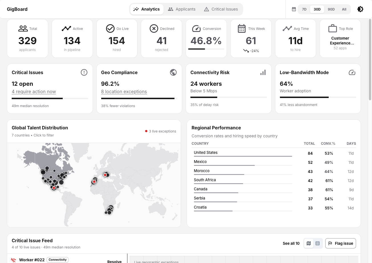
I led the design of a unified, real-time Operational Intelligence Dashboard. By shifting the platform from reactive log-checking to proactive, geospatial issue resolution, we transformed how clients manage decentralized workforce.
The Impact:
63%
faster issue resolution
(HR response times dropped from 2.1 hours to 49 minutes)
38%
reduction in geographic contract violations
within 3 months
72%
increase in worker-reported tech issues
due to the introduction of an anonymous, low-bandwidth reporting UI.
- 63% faster issue resolution (HR response times dropped from 2.1 hours to 49 minutes).
- 38% reduction in geographic contract violations within 3 months.
- 72% increase in worker-reported tech issues due to the introduction of an anonymous, low-bandwidth reporting UI.
Discovery & System Mapping
To define the architecture of the dashboard, I needed to understand the failure points of the current system. I analyzed 6 months of historical worker logs (10,000+ entries) and facilitated workshops with 15 cross-functional stakeholders.
System Failure Patterns Identified:
- 35% of campaign delays were directly linked to internet speed drops on the worker’s end.
- 20% of workers unintentionally violated location clauses due to a lack of geographic enforcement tools.
- Data Silos: Critical operational issues were buried in chat logs, emails, and disconnected databases.
I mapped the existing worker hiring and monitoring workflows using FigJam, clustering 58 distinct pain points into core themes. Using a MoSCoW matrix, I aligned executives, HR managers, and operations leads on a unified product requirements document.
User Needs
The Asymmetry of the Workforce
Designing a two-sided marketplace requires balancing asymmetrical needs. What provides control for an executive can create friction for a worker.
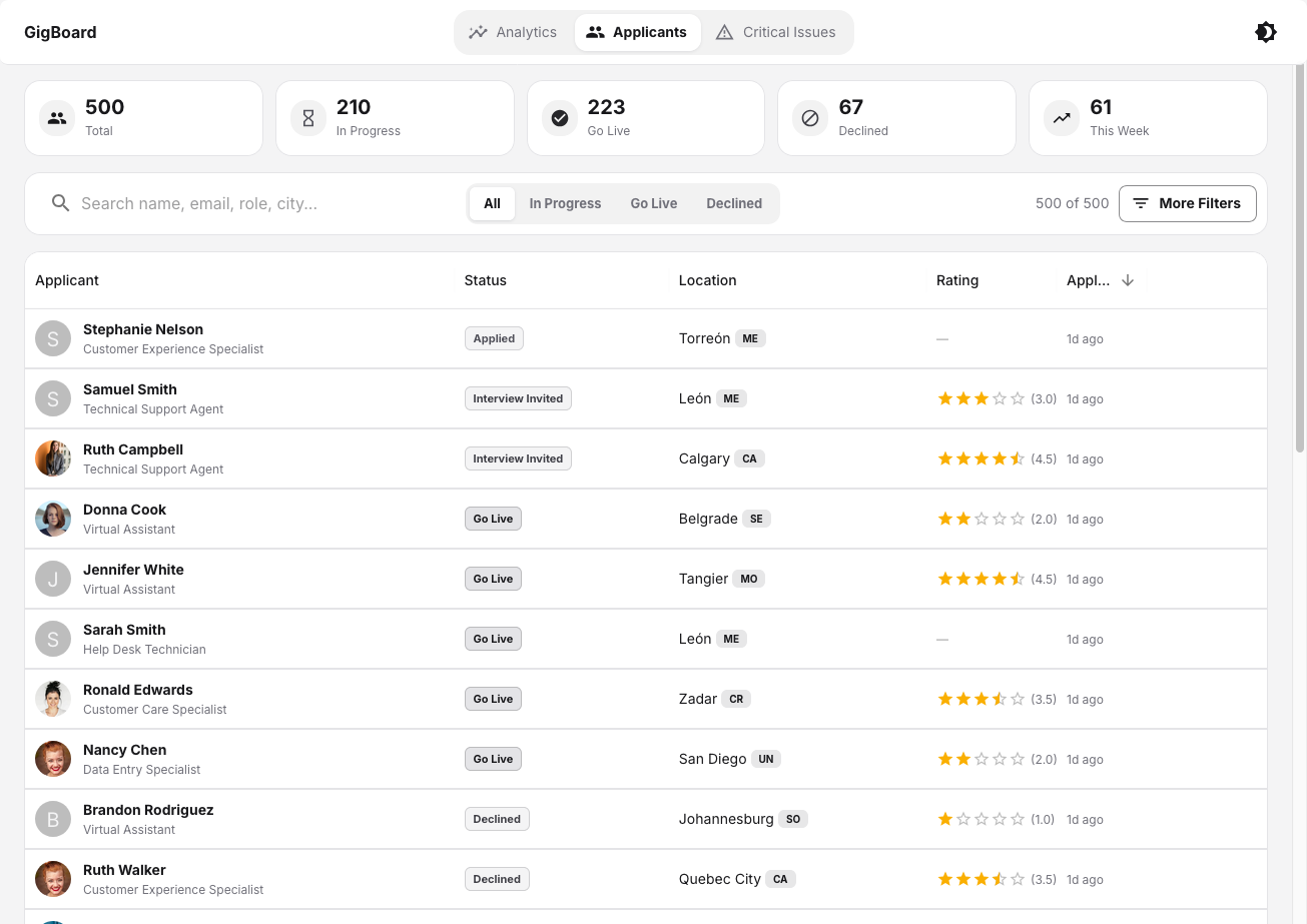
The Client View (Control & Forecasting)
- Operations Leads needed macro-level geographic insights to allocate resources.
- HR Managers needed real-time alerts to resolve idle workers and compliance breaches immediately.
- Executives required predictive analytics to assess performance against operational costs.
The Worker View (Safety & Access)
Interviews with 15 gig workers revealed a different reality. Workers feared reporting technical issues because they assumed they would be penalized or lose hours. Furthermore, heavy client-side tracking tools often failed on unstable internet connections.
Architecture & Core Design Decisions
Real-Time Geospatial Compliance
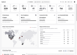
HR managers cited geographic compliance tracking as a critical blind spot in 100% of our workshops. I designed a map-centric view using Google GeoChart integrations.
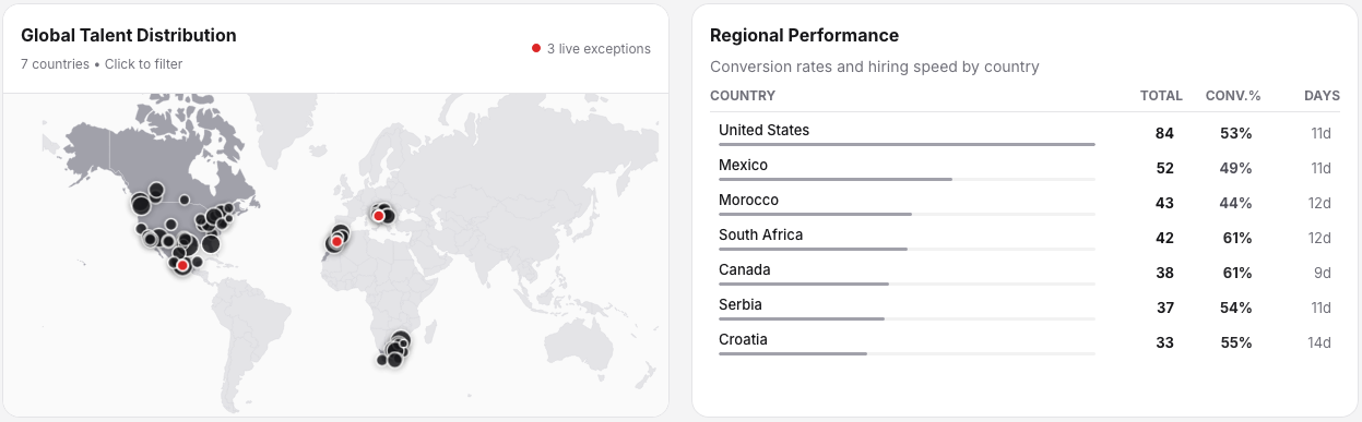
- Decision: Rather than lists of IP addresses, the dashboard visualizes worker locations, instantly flagging non-contract regions with red markers.
- Outcome: Caught relocation breaches in real-time—a process that previously took up to 8 days.
Critical Issue Feed (From Tabs to Scroll)
Initial wireframes utilized a tabbed interface to separate different types of alerts. Usability testing revealed that users frequently missed critical alerts hidden in secondary tabs.
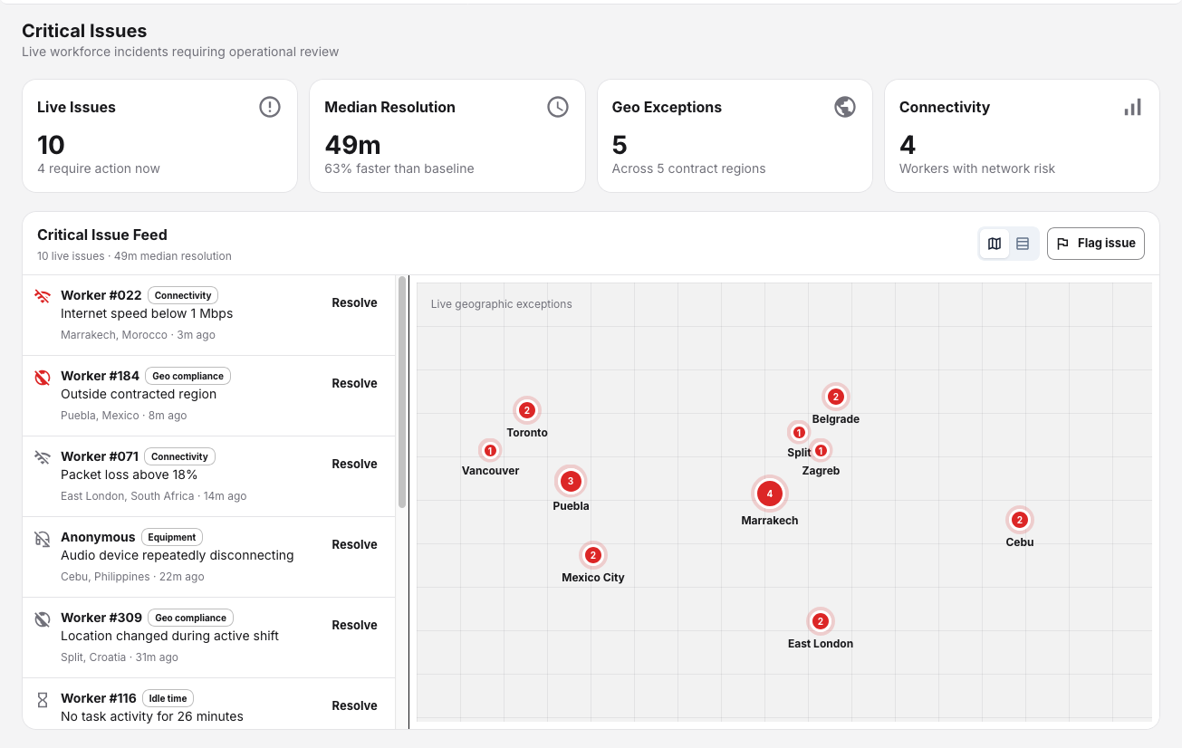
- Pivot: I transitioned the architecture to a single, scrollable “Critical Issue Feed” paired with a map-to-table toggle. This allowed managers to view geographic dispersion while instantly actioning live alerts (e.g., “Worker #022: Internet speed <1Mbps”).
- Outcome: Task completion speeds improved by 25% during usability testing.
Equity-Driven Constraints: Low-Bandwidth UI
You cannot manage what you cannot measure. To solve the issue of unreported tech failures, I designed an anonymous “Flag Issue” workflow for workers. More importantly, I introduced a text-only, low-bandwidth mode for the worker UI.
- Decision: Strip away heavy visual assets for workers in regions with unstable internet (India, Philippines), focusing purely on task alerts and issue reporting.
- Outcome: 64% of workers in low-bandwidth regions adopted the text-only UI, reducing task abandonment by 41%.
5. Final Interactive Data Visualizations
By aggregating historical data to forecast worker demand, the platform evolved from a monitoring tool into a strategic asset.