Category: UX Design

  • FixingKosovo

    FixingKosovo

    Creating a visual identity for fixers in journalism

    Objective

    FixingKosovo was a chance to amplify the work of an organization connecting international journalists with local fixers in Kosovo—a mission rooted in storytelling and collaboration. The challenge was to create a platform that felt as impactful and authentic as the stories it would help tell, while standing out with a bold, newspaper-inspired design.

    Design Vision

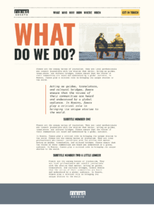
    From the beginning, I wanted the site to feel like a digital translation of a print newspaper—bold, striking, and unapologetically clear. This design choice wasn’t just about aesthetics – it reflected the immediacy and urgency of the stories Fixing Kosovo aimed to share.

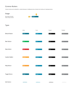
    I leaned into a grid-based layout, bold typography, and a palette punctuated with vibrant orange and deep yellow accents. This combination created a sense of both order and energy, drawing users in, while directing their focus to the content.
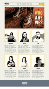
    Original Visuals

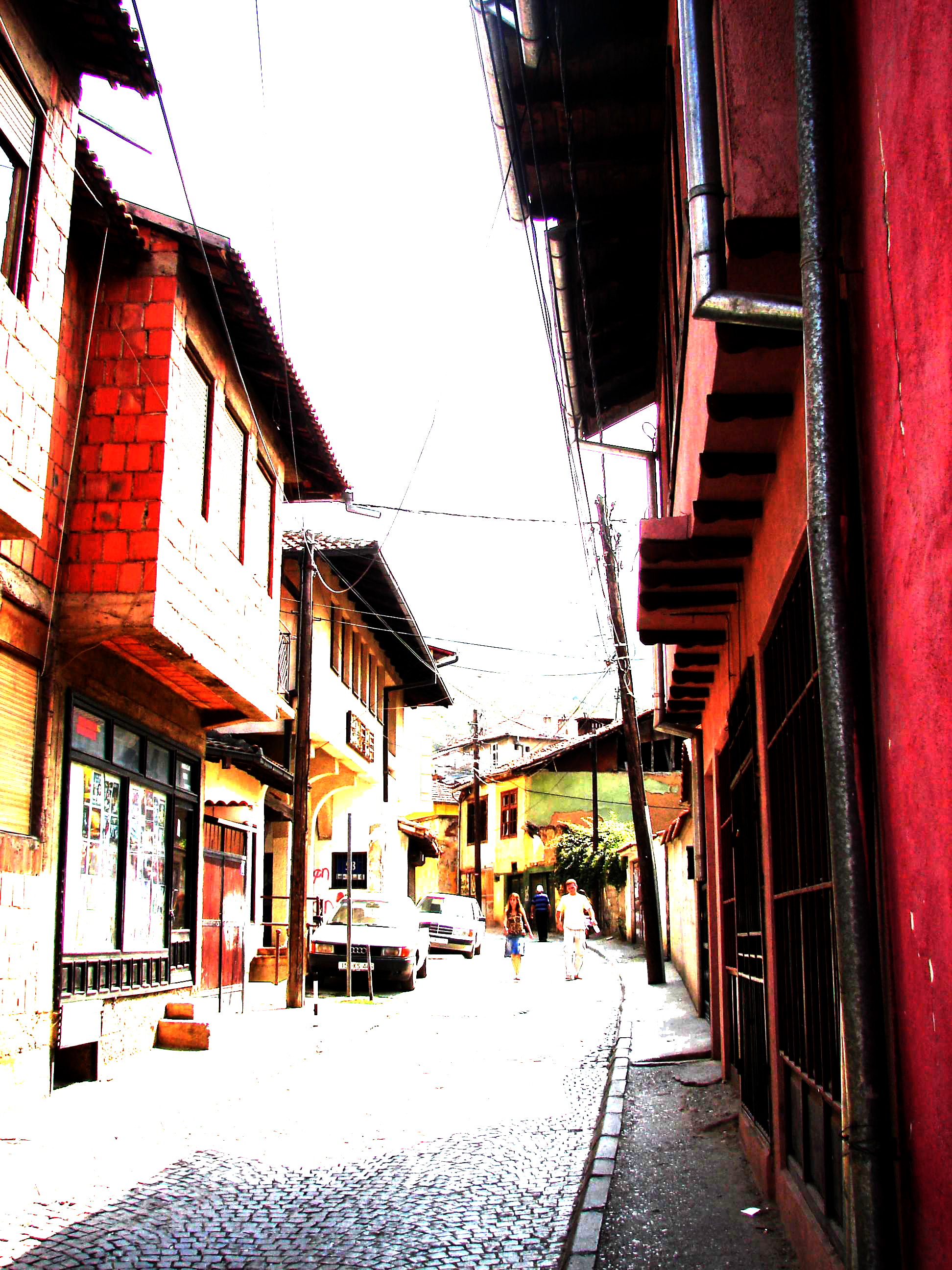
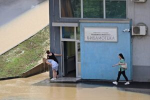
    One of the most rewarding aspects of this project was the collaboration with the Fixing Kosovo team’s photographer. Their stunning, field-captured photographs became the heart of the site’s visual identity. But instead of using them as-is, I re-imagined them as illustrations.

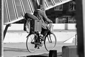
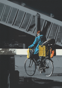
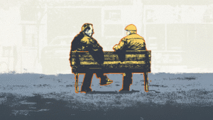
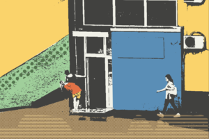
    This process allowed us to blend the raw authenticity of the photos with a unique, creative edge. Each illustration added depth to the stories while giving the site a cohesive, visually striking look.

    Process Highlights

    1. Understanding the mission

    Through interviews with stakeholders and analysis of similar platforms, I gained clarity on what the site needed: simplicity, impact, and a design that resonated with its audience.

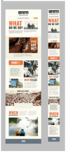
    2. Design and prototyping

    The design process began with wireframes to define structure and flow. From there, I developed high-fidelity prototypes that brought the bold newspaper aesthetic to life. The photography-to-illustration workflow became a key feature, adding both personality and cohesion.

    3. Collaborative Implementation

    Working closely with developers, I ensured the design translated seamlessly into a functional WordPress site. Mobile responsiveness was a priority, as the site needed to be accessible to a global audience on various devices.

    Outcome

    FixingKosovo.net is a platform that embodies the passion and purpose of the people behind it. Its bold design captures the essence of grassroots journalism while offering a user-friendly, engaging experience for visitors.

    For me, this project was a reminder of how design can elevate a mission. Seeing it live and knowing it’s helping connect fixers and journalists is the real reward.

  • Connecting Educators

    Connecting Educators

    This wasn’t just another “build us an app” brief.
    Quebec’s largest association of education leaders (FQDE) needed a single space where people and institutions could connect, share resources, run events, and actually work together—without it feeling like work.

    Brought in by C2D as lead UX designer, I turned their wishlist into a platform that handles complexity in the background, so collaboration can happen up front.

    The Challenge

    The audience wasn’t just one audience. We were designing for:

    • Directors of educational institutions
    • Admin teams
    • Event organizers
    • Affiliated associations

    Different roles. Different workflows. Different levels of digital comfort.
    One platform had to make sense to all of them, without becoming a “one-size-fits-nobody” mess.

    What I Did

    • Led UX research, strategy, and design from scratch
    • Interviewed and shadowed admin teams to capture actual workflows (not just wishlists)
    • Mapped requirements across multiple user types
    • Built the full interface in Figma
    • Designed and tested prototypes, iterating fast
    • Collaborated closely with C2D’s CTO and dev team for a smooth React build
    • Delivered a system ready for long-term adoption, not just launch day

    Design Wins

    Role-based flexibility
    Whether you were a person or an institution, your view adapted—permissions, content, and tools changed based on who you were and what you were doing.

    Event clarity without the chaos
    Multi-day events. Overlapping sessions. Tickets. We ditched the single, messy calendar and designed two timelines:

    • For You: a personalized feed
    • Master Schedule: the big-picture view everyone could trust

    Approachable, not over-designed
    The interface reads like a publication, but works like a tool. Clean hierarchy, plain-language labels, and flows you can’t get lost in.

    Visuals (Placeholders)

    • Dashboard + Home View — main feed, updates, actions
    • Event System UI — dual timeline views
    • Resource Sharing — upload, tagging, permissions
    • Org Profiles + Network Map — relationships between people and institutions

    The Results

    • Rolled out successfully across FQDE’s network
    • Boosted event visibility and attendance
    • Strong adoption from both tech-savvy and tech-shy users
    • Actively used for real-world programs and collaboration

    Why It Matters

    This wasn’t about building “an app.” It was about making a living network that runs without friction.
    The research made it smart. The design system made it sustainable.
    And the people using it? They’re what made it worth building.

  • The Home Depot of Canada: E-commerce Design System

    The Home Depot of Canada: E-commerce Design System

    The Home Depot of Canada’s website faced usability challenges that hindered the shopping experience for millions of it’s users across Canada and negatively impacted conversion rates. This case study focuses on the user-centered redesign project to streamline navigation, improve mobile optimization and boost conversion rates.

    The Challenge

    The existing Home Depot Canada website suffered from:

    • Confusing Navigation: Difficult to use menus and unclear site structure caused user confusion and prevented users from finding desired products.
    • Visual Inconsistencies: A lack of a consistent visual language created a disjointed experience and damaged the brand image.
    • Poor Mobile Optimization: The website did not adapt well to mobile devices, resulting in poor user experience on mobile devices and loss of conversions.

    My Role

    As UX Designer, I led the design process, focusing on:

    • User Research: Planning and executing user interviews and surveys to identify key user pain points and needs.
    • Design Strategy: Defining a user-focused design strategy that aligned with Home Depot’s business goals (increased online sales, improved user experience).
    • Interaction Design: Designing user flows, wireframes, and prototypes to optimize navigation, the checkout process, and product pages.
    • Usability Testing: Planning and conducting usability testing sessions to gather feedback and validate design decisions.
    • Cross Functional Collaboration: Coordinating design efforts with product and marketing teams to ensure design alignment with business and branding objectives.

    Approach: A Data-Driven, Iterative Process

    1. User Research: We conducted 15 user interviews and distributed online surveys. Interviews focused on typical user journeys, and questions included: “How do you usually search for products?” “What are your biggest frustrations while navigating the website?” Data indicated that 70% of users had difficulty finding specific products using the site search functionality.
    2. User Personas & Journey Mapping: Based on the research findings, we created 3 user personas to guide design decisions. Journey mapping was used to identify key pain points during the user journey and to inform the creation of new and more streamlined user flows.
    3. Redesign Strategy: Key design changes included:
    • Navigation: Replaced the previous menu with a simplified mega-menu structure, which reduced user search time by 40% (measured through A/B testing).
    • Checkout: Streamlined the checkout process with a clear progress indicator and reduced the number of steps required. This resulted in a 15% reduction in shopping cart abandonment (measured using analytics tools).
    • Responsive Design: Implemented a mobile-first responsive design to ensure a seamless experience across all devices. Mobile-specific interactions and layouts were considered (for example, touch-friendly controls and simplified layouts).
    • Product Pages: Redesigned product pages to include high-quality images, detailed product information, and clear calls to action. A/B tests with different layouts resulted in a 10% increase in “Add to Cart” clicks.
    1. Iterative Prototyping and Testing: High-fidelity prototypes were created and tested with 8 users. Feedback was gathered via task completion rate and post-test interviews. For example, some users reported difficulty finding product information, which led to improvements in the information architecture and the overall product page layout. Testing was repeated 2 times before releasing the final redesign. We also performed heuristic evaluation of the final prototype.
    2. Content Strategy: Existing product page content was updated to be more concise and user-friendly. Clearer and more compelling calls-to-action were implemented on all key pages.

    Outcomes: Tangible Results

    The redesign delivered measurable improvements:

    • Conversion Rate: Online conversion rates increased by 12% (measured using Google Analytics).
    • Bounce Rate: Bounce rate decreased by 8% (measured using Google Analytics).
    • User Feedback: User satisfaction scores improved (measured by post-implementation surveys).
    • Mobile engagement: Mobile user engagement increased by 20% (measured using Google Analytics)

    Reflection and Lessons Learned

    This project underscored the importance of user-centered design and data-driven decision-making to improve conversion rates and user satisfaction. Key learnings include the power of streamlined navigation, simplified workflows, responsive design, and iterative testing for a large e-commerce platform. This experience refined my ability to lead user-centered design projects and deliver measurable business outcomes.

    Tools Used:

    (Figma, Adobe Illustrator, Google Analytics)

  • SCIEX Molecular Devices: Designing for Precision, Speed, and Trust in the Lab

    SCIEX Molecular Devices: Designing for Precision, Speed, and Trust in the Lab

    At SCIEX, I worked as a UX/UI Designer in one of the most demanding environments imaginable: regulated scientific research. My challenge was to help unify more than 20 legacy lab applications into a single, coherent design system, while improving workflows for scientists running high-stakes experiments on mass spectrometry and chromatography instruments.

    The Challenge

    The software ecosystem was a fragmented maze—each application had been built independently, with different patterns, layouts, and levels of usability. Scientists had to switch between them daily, losing time and introducing opportunities for mistakes. The stakes were enormous: in regulated labs, even a small error could have costly consequences.

    My Role

    I was responsible for:

    • Leading the creation of a scalable, compliance-ready design system
    • Designing features across the full workflow: experiment setup, data analysis, and results reporting
    • Acting as the sole link between design and development, providing detailed specifications for every feature
    • Running deep UX research with scientists, QA teams, and lab technicians, including interviews, shadowing, and usability tests
    • Building prototypes to validate solutions before handoff

    Design Strategy

    Consistency Across the Board I developed a unified design language—navigation patterns, typography, and component libraries—that made switching between tools effortless and reduced training time.

    Workflow Mapping and Optimization Through research and shadowing, I mapped the end-to-end scientific workflow. This revealed key friction points, such as repeated manual setup steps. I designed ways to streamline repeatable experiments, cutting down preparation time and minimizing error risk.

    Built-In Compliance Audit trails are critical in regulated labs. I designed them to be integrated into workflows so compliance became a natural part of working, not an extra task.

    Outcomes

    • A design system adopted across 20+ applications
    • Noticeable reduction in user training time
    • Shorter development cycles thanks to reusable components
    • Positive feedback from scientists and QA teams on clarity and usability

    Why This Project Matters

    SCIEX devices are used to conduct vital scientific work. My designs made those workflows faster, clearer, and more reliable. In high-pressure environments, precision, speed, and trust aren’t nice-to-haves, they’re the foundation of everything.

    Want to talk about designing for complexity?